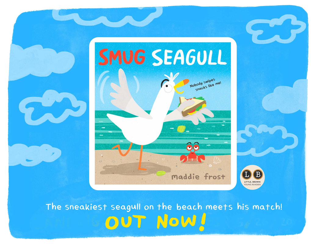
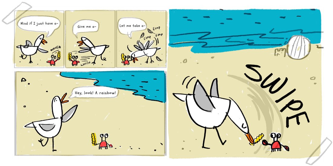
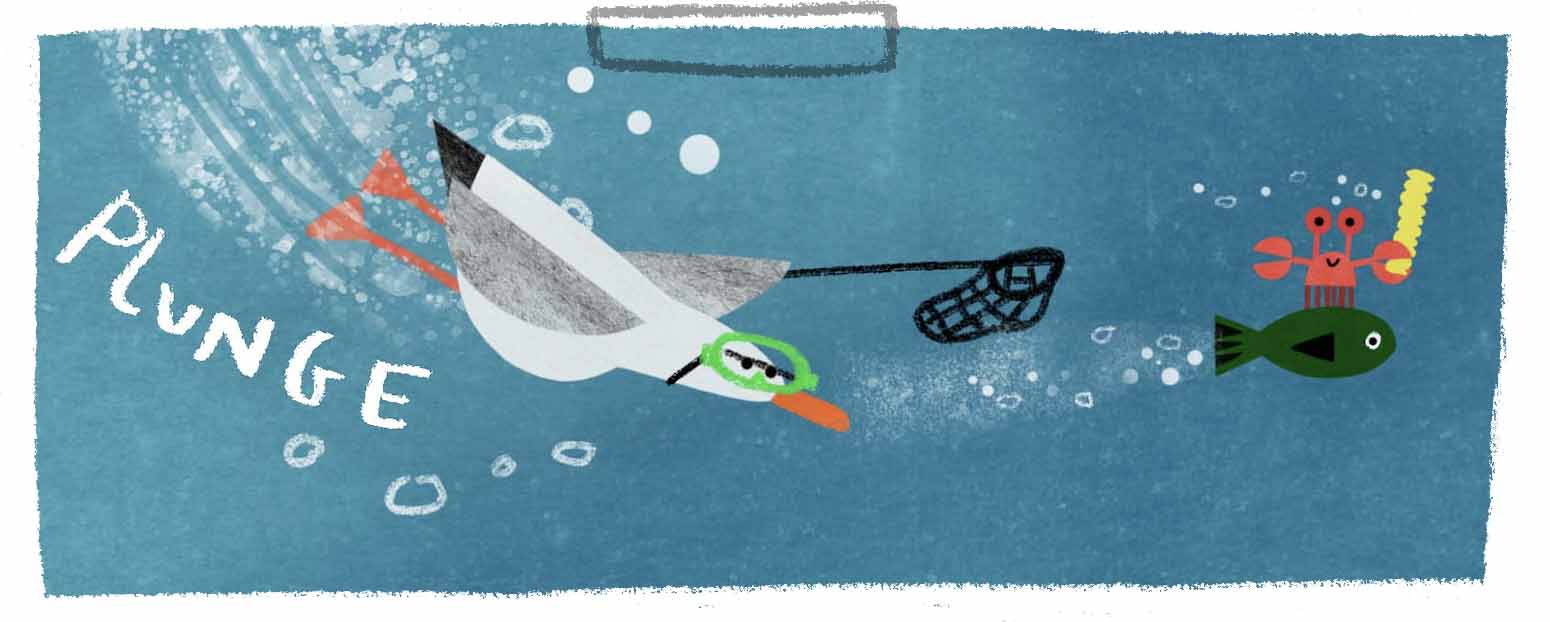
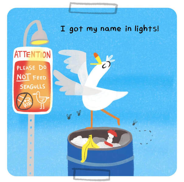
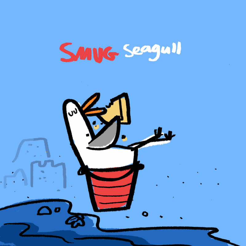
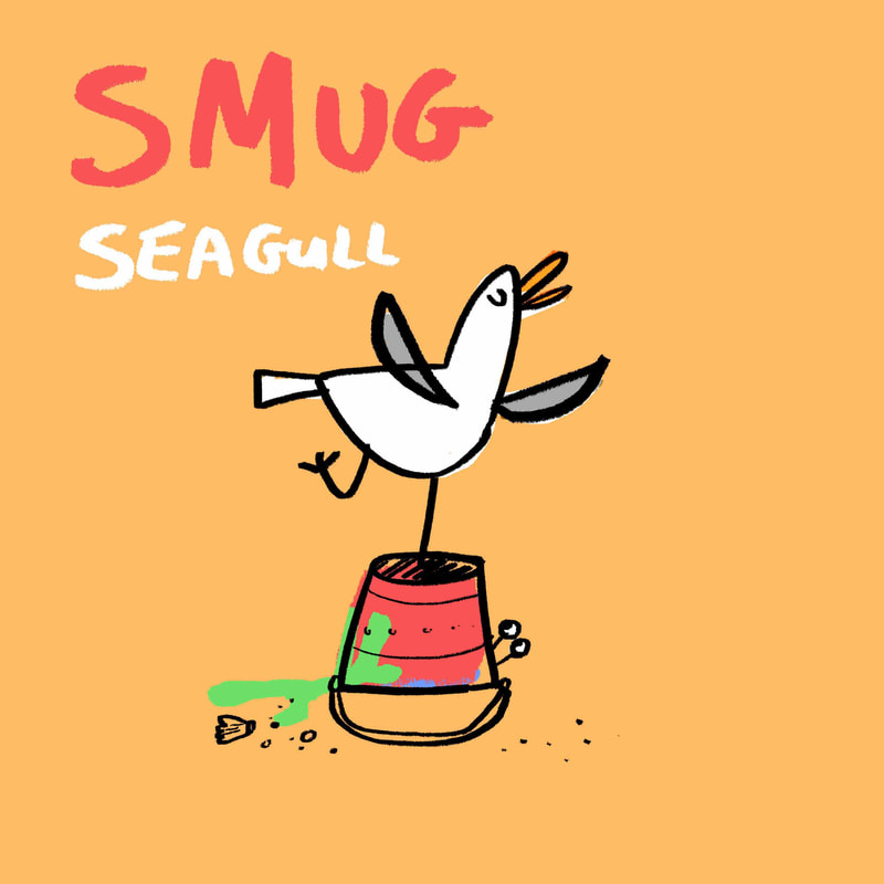
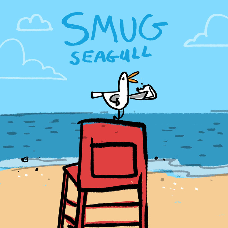
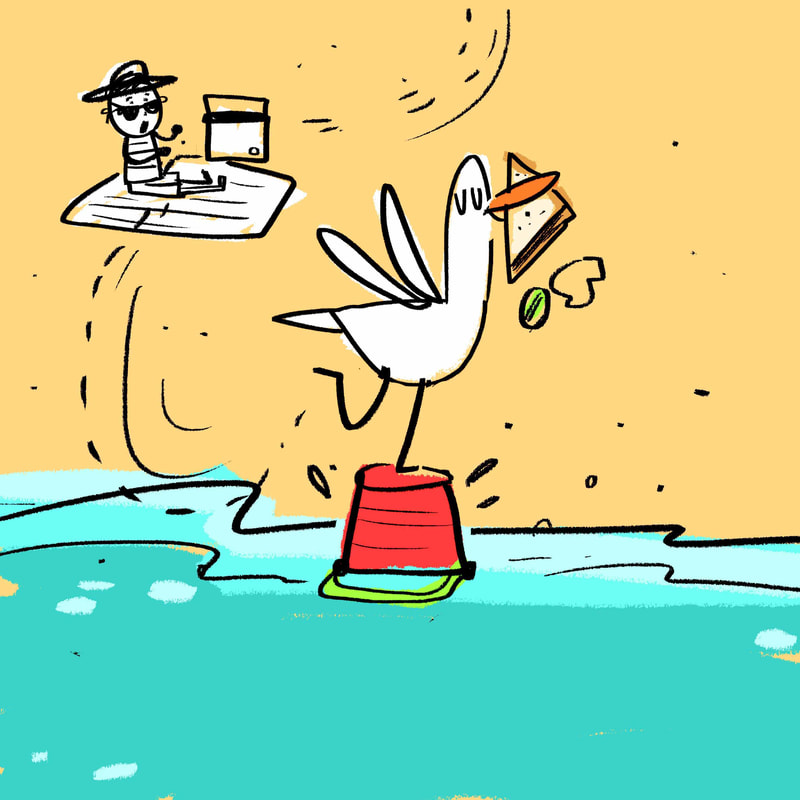
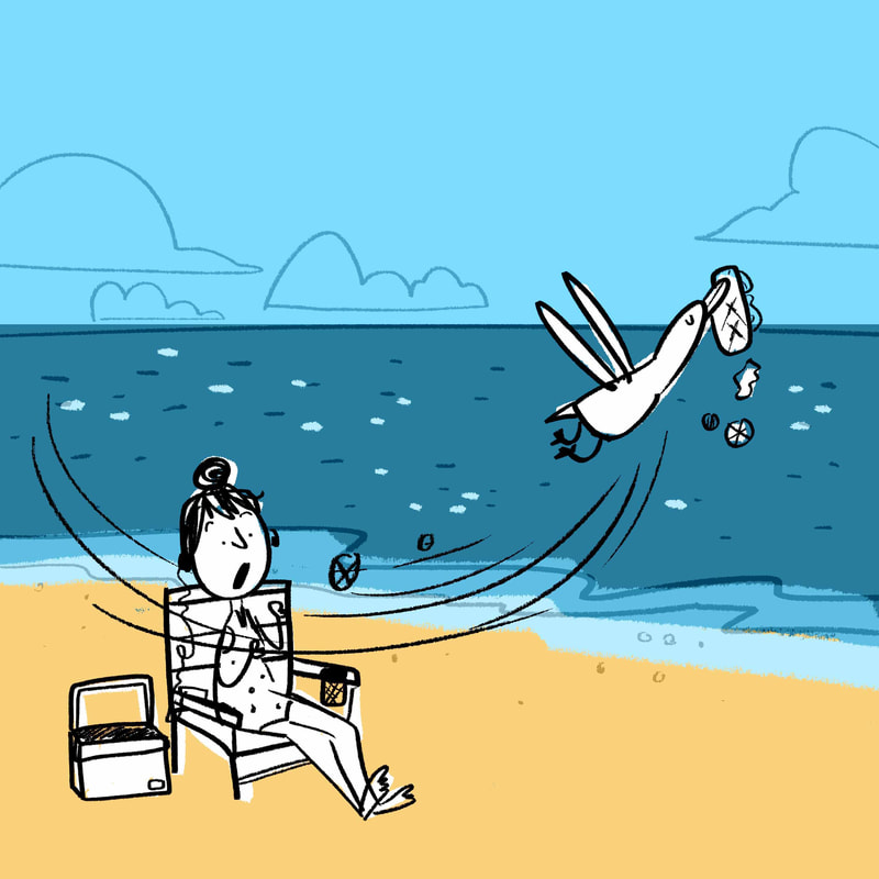
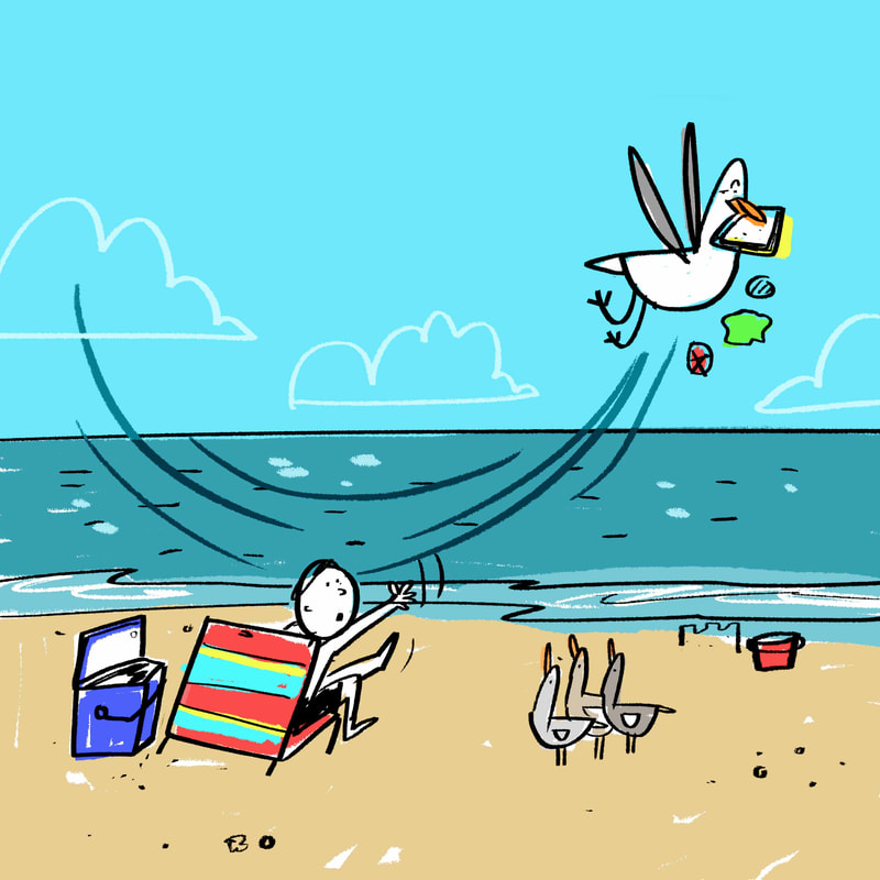
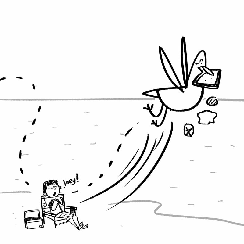
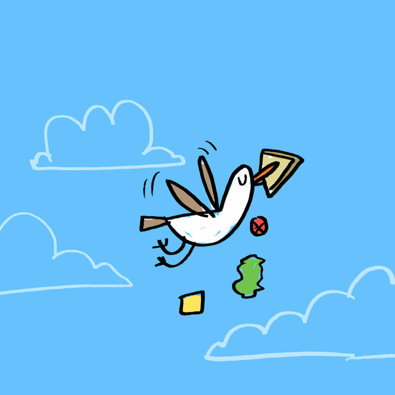
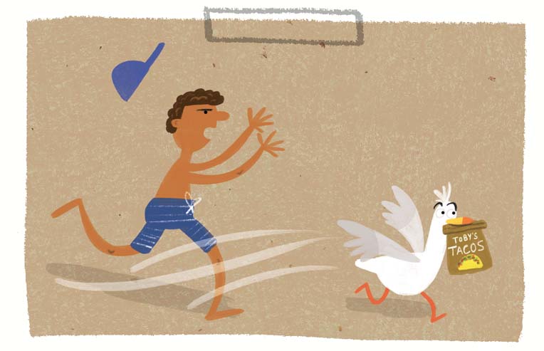
"The comics-influenced storytelling, with sunny-hued panels and speech balloons, is ideal for the text’s cheeky humor, which owes something of a debt to Mo Willems’ Pigeon books."
"Swipe this one off the shelf for a belly-laugh–inducing beach read. (Picture book. 3-7)"
"Swipe this one off the shelf for a belly-laugh–inducing beach read. (Picture book. 3-7)"
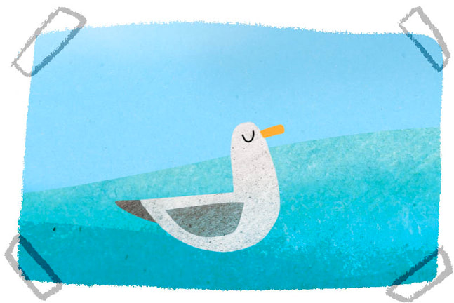
The idea for Smug Seagull came while I was illustrating a book about the water cycle. Random, I know. In an ocean spread I put a seagull bobbing on top of the water with his eyes closed. He looked 100% like a very smug seagull.
It was obvious he thought he was the best at something...But what? Then I thought about food (what else is new) and LIGHTBULB! He would be THE BEST food swiper from shore to shore. That's a fact!
Not to mention I once had my entire sandwich stolen OUT OF MY HANDS from a seagull. It was my chance to teach them a lesson. *wink*
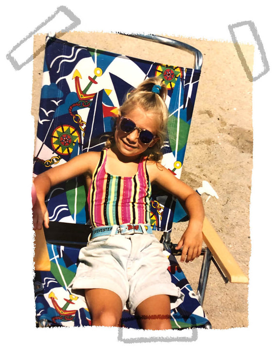
I tapped back into my memories of vacations to Cape Cod with my family. Here I am putting out the beach vibes with my sweet Looney Tunes belt and giant shorts.
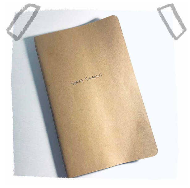
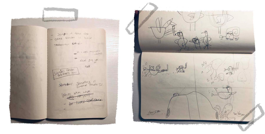
I used this simple sketchbook to do all of my story brainstorming. I like having a very non-intimidating place to process my thoughts. The less fancy the sketchbook is, the better I think. It's literally just pages of me talking to myself. There's definitely a few "Maddie, that makes absolutely no sense" in there.
As an animation major and cartoon lover, my brain naturally breaks down stories into comic book format. Using large panels felt like the most authentic way to share this story.
And I knew the seagull would do all the talking. His voice came through loud (too loud) and clear from the very beginning.
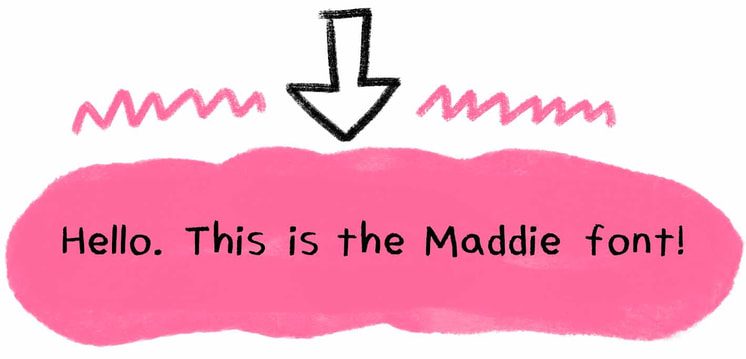
Another cool thing is that the book's font is my handwriting. My wonderful team at Little, Brown liked my actual handwriting in my sketches so we all agreed that making a Maddie font was the way to go.
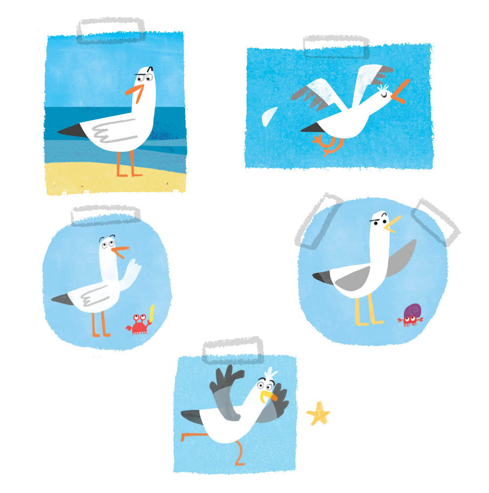
I wanted simple designs for the characters. I always feel that less is more and since I was using panels I didn’t want tons of detail to take away from the story. And I wanted kids to be able to draw these guys! I learned to draw from copying stuff in front of me so they needed to feel simple enough for easy doodling.
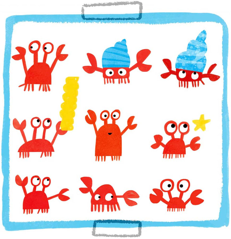
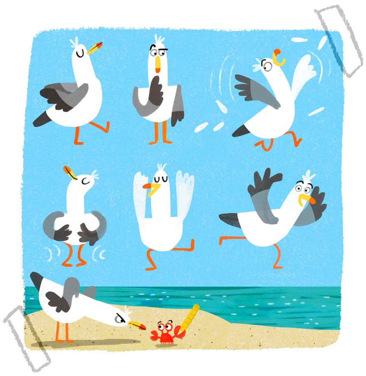
Here's some early development art for the seagull and little crabby.
Here's some early development art for the seagull and little crabby.
The art for the book was done in some scanned mixed media paper (for background texture) and digital brushes in Photoshop.
I loooooove designing covers. It's a very magical part of the process for me. Here are a few I played with before ending up with the final design.
I loooooove designing covers. It's a very magical part of the process for me. Here are a few I played with before ending up with the final design.
The last thing I'll leave you with is a fun fact. Because I like fun. And facts!
*FUN FACT*: Most of the labels on the snack bags are named after people in my family.
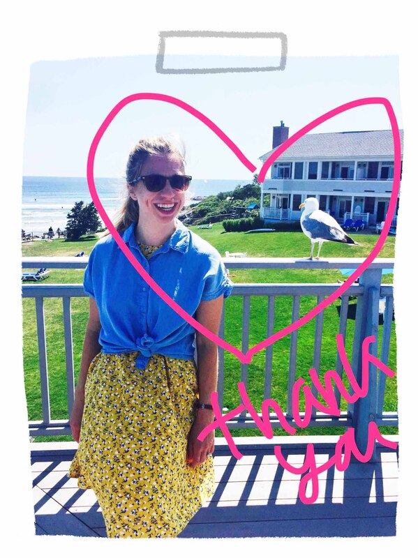
Hey thanks for reading up about my new book! I hope you like and I hope it makes you laugh. Maybe it will just make you hungry and that's okay too.
xo Maddie
Hey thanks for reading up about my new book! I hope you like and I hope it makes you laugh. Maybe it will just make you hungry and that's okay too.
xo Maddie
